Scheduled transition page - 2024 09 13
Text component
This is the main content of your page and the most commonly used component on your website.
Writing for the web guidelines H3
Here are a few writing guidelines to make your web page more readable
Write to a reading grade level of 8 or lower whenever possible H4
This makes your website accessible to a wider range of users and allows the content to be understood by almost all, with links included
Tips for writing at lower reading grades: H5
- break apart sentences when possible, and keep them short
- avoid jargon, complex words and phrases. Consider adding a glossary for terms your readers may not know
- use headings and bullet points to break up your content into smaller chunks
- Expand acronyms on first use. For example, Web Content Accessibility Guidelines (WCAG)
- use images, illustrations, video and audio to help clarify meaning

Header size H6
Horizontal Rules
And spacing around them
Document links in Body component
Copy the URL from the media page and insert link into highlighted text.
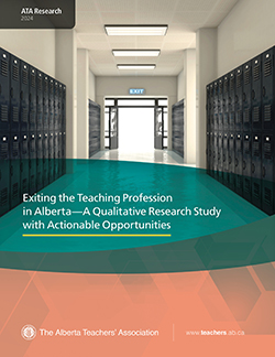
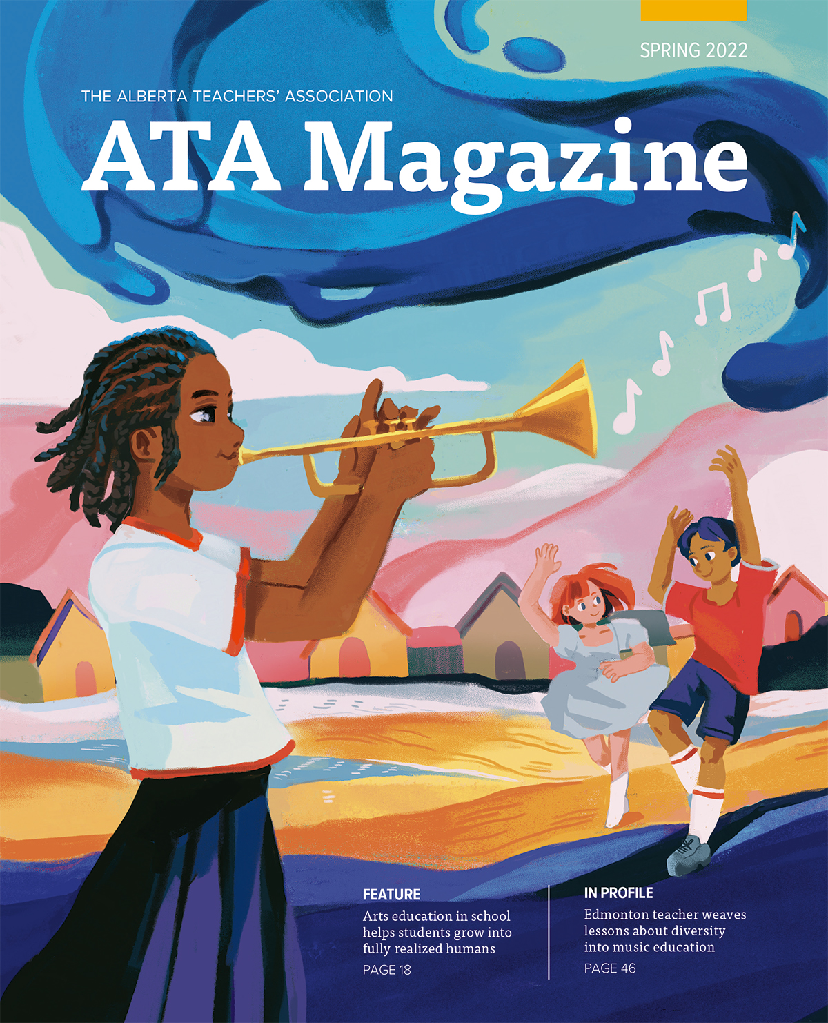
Document display component
Accordion component
The accordion is used to group information for a more readable and condensed page format
Node heading #1
Node text block #1 - incorporate all the information under this heading that is required. Ensure to use good writing for the web styles that are articled above
A link can also be added
Node heading #2
Continue with more information about your second item in the text block.
Table styles
| Header Row | Column 1 | Column 2 | Column 3 | Column 4 | Column 5 |
|---|---|---|---|---|---|
| Row 1 | Table body | Table body | Table body | Table body | Table body |
| Row 2 | Table body | Table body | Table body | Table body | Table body |
| Row 3 | Table body | Table body | Table body | Table body | Table body |
Style 2
| Header Row | Column 1 | Column 2 | Column 3 | Column 4 | Column 5 |
|---|---|---|---|---|---|
| Row 1 | Table body | Table body | Table body | Table body | Table body |
| Row 2 | Table body | Table body | Table body | Table body | Table body |
| Row 3 | Table body | Table body | Table body | Table body | Table body |
Column head
| Header Row | Column 1 | Column 2 | Column 3 | Column 4 | Column 5 |
|---|---|---|---|---|---|
| Row 1 | Table body | Table body | Table body | Table body | Table body |
| Row 2 | Table body | Table body | Table body | Table body | Table body |
| Row 3 | Table body | Table body | Table body | Table body | Table body |
Column head 2
| Header Row | Column 1 | Column 2 | Column 3 | Column 4 | Column 5 |
|---|---|---|---|---|---|
| Row 1 | Table body | Table body | Table body | Table body | Table body |
| Row 2 | Table body | Table body | Table body | Table body | Table body |
| Row 3 | Table body | Table body | Table body | Table body | Table body |
Use sentence case
Studies have found that it's easier for users to scan content when it is in sentence case as it allows the eye to flow better. By writing in sentence case you are actually helping your users find what they are looking for more quickly.
Use headings to convey meaning and structure
Use short headings to group related paragraphs and to describe the sections. This provides an easier flow of reading and understanding the content for the user. Heading1 (H1) is only used for page titles and should not be used within the content. Use Heading2 (H2) to break content into smaller, more specific sections. Heading3 (h3) is used as a subheading of H2 (do not skip heading levels e.g. Heading4 (H4) should not be nestled directly under H2). It also breaks it down into smaller sections which is less overwhelming than a wall of text. It provides organization as it helps users find specific content that they might be looking for in a page.
Use lists (bullets, numbers) for groups of related items
Use numbered lists to list steps in a process. Use bulleted lists for lists of links or other information.
Here's a list example
- item one
- item two
Here's a numbered example
- first item
- second item
- third item
- fourth item
- fifth item
- sixth item
- seventh item
- eighth item
- ninth item
- tenth item - The Alberta Teachers’ Association, as the professional organization of teachers, promotes and advances public education, supports teachers' professional practice and serves as the advocate for its 46,000 members.
Features section one

Features section two


Features section three

Features section two columns thumbs

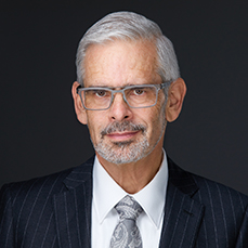
Profile section component
Author's position
This component is a tool used to highlight staff, local heroes, or volunteers.
Photos should be 560x560px
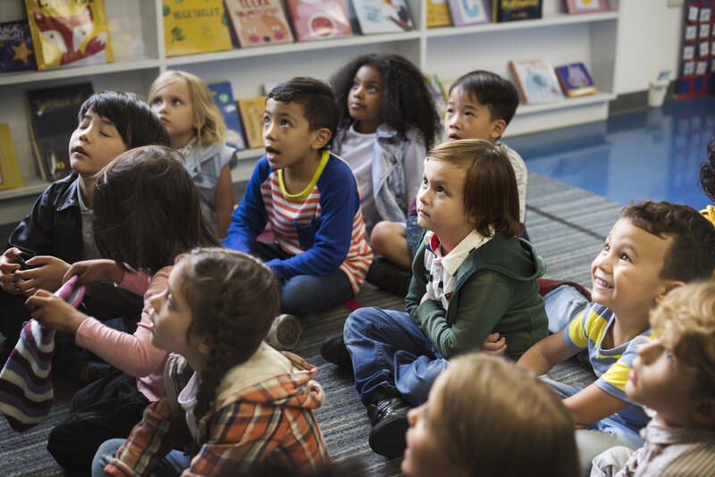
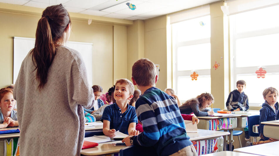
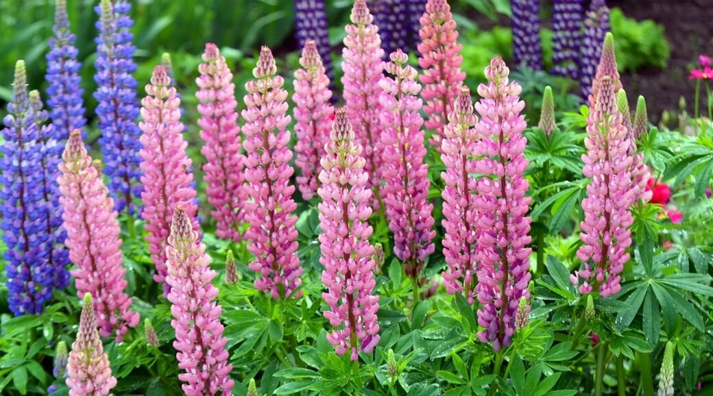
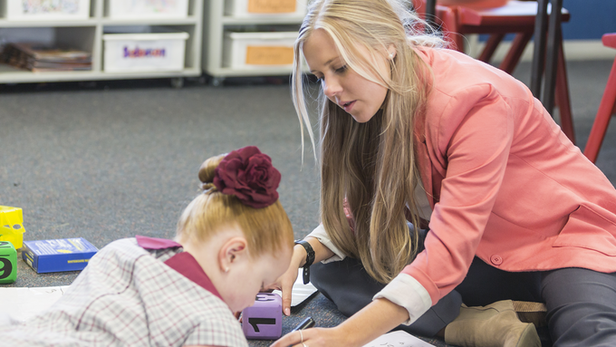
Text and media component

The text and media section allows the author to add images to large text components. A meaningful, high-quality image can be a powerful tool to draw users to a page, keep them engaged, or encourage them to take action.
Image alternative text guidelines
- Provide a short description with only the essential information of what the image represents
- Exception: When an image is used for a button or call to action, provide alternative text that describes the function of the button (e.g. Submit the form), rather than describing the image
- If an image including text must be used, include that text within the alternative text description of the image
- Graphs and diagrams should be clearly summarized in the alternative text
Small call to action component
Use the small call to action to break up the content on the page. Ensure you only place this link once on the page.
Plain text page name
Image gallery component
Workshop section component
Workshop Section subtitle
Workshop Name
Use the description to sell your readers on signing up for this event. Insure to include the most important information like location, date, time and cost.
Person 2
Use the description to sell your readers on signing up for this event. Insure to include the most important information like location, date, time and cost.
Book Example 1
Lorem ipsum dolor sit amet, consectetur adipiscing elit. Multoque hoc melius nos veriusque quam Stoici. Duo enim genera quae erant,.
Book Example 2
Lorem ipsum dolor sit amet, consectetur adipiscing elit. Multoque hoc melius nos veriusque quam Stoici. Duo enim genera quae erant,.
Related content area component

Section title
Related content helps the user to continue on the website to find out more information. Do not repeat other links on the page but highlight other pages that could be of interest on the same topic.

Section title 2
Layout for this section creates the most design integrity with three components
Section title 3
If the section descriptions are of similar length it does help the design integrity. This is where content creators can get creative!
Contact information component
Location address
Make it easy to find the contact for a staff member or organization by using this component.